Color has a way of influencing how a space feels from the moment you step inside. The right tone can make a room feel open and airy, warm and inviting, or calm and restorative. Choosing the right shade is not just about preference. It also involves understanding how color works with light, furniture, and the purpose of the space. With a few guiding principles, you can approach paint selection with confidence and create a cohesive look throughout your home.
Understanding the Role of Light
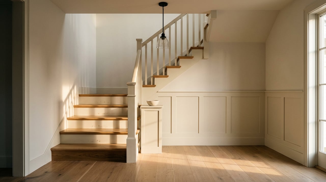
Natural and artificial light both play a major role in how color appears on your walls. Rooms with large windows and abundant sunlight often handle deeper or bolder colors well because the light keeps the space from feeling closed in. North-facing rooms tend to have cooler light, which can make colors look slightly muted, while south-facing rooms bring out warmer tones.
Artificial lighting also matters. Warm bulbs can enhance earthy and neutral shades, while cooler bulbs may make colors appear crisper. Testing paint swatches at different times of the day is one of the most effective ways to see how a color will really look.
Connecting Color to Room Function
When thinking about how to choose colors for a room, consider how the space will be used. Bedrooms often benefit from calming shades such as muted blues, soft greens, or warm taupe. Living rooms can
handle warmer neutrals or even rich jewel tones, depending on the desired atmosphere.
handle warmer neutrals or even rich jewel tones, depending on the desired atmosphere.
Lighter shades often work best for kitchens because they reflect light and create an open feel. However, accent walls or bold cabinet colors can add personality without overwhelming the space. In home offices, greens and blues can promote focus, while softer neutrals maintain a professional look.
Considering the Room’s Size and Shape
Color has a visual impact on perceived size. Lighter tones generally make a room feel more open, while darker shades can make it feel more intimate. Vertical stripes or color blocking can change how tall or wide a space appears.
For small rooms, a single light shade across all walls can create continuity. In larger spaces, you can define different areas with complementary but distinct tones. This approach works especially well in open-plan layouts.
Coordinating with Existing Elements
Your choice of wall color should work with the flooring, trim, and furniture already in place. Warm wood floors often pair well with earthy or warm-toned neutrals, while cooler flooring materials like gray tile can match better with blues, grays, or crisp whites.
If you have a statement piece, such as a bold sofa or an intricate rug, you can pull wall color inspiration directly from those tones. This helps create a connected, intentional design rather than a set of competing colors.
Using Undertones to Your Advantage
Even neutral colors have undertones that can change how they feel in a room. A beige with pink undertones will look warmer, while one with green undertones will feel cooler. The same applies to grays, which can lean toward blue, green, or even violet.
Looking at a paint color next to a pure white swatch can help you see the undertone more clearly. Being aware of this detail ensures your chosen shade complements rather than clashes with other elements in the room.
The Power of Accent Walls
Accent walls allow you to introduce a bolder color without committing to it across an entire space. This can be especially effective in bedrooms behind the headboard, in dining rooms on the wall facing the entry, or in living rooms behind the main seating area.
Choosing an accent color that ties into other elements—like throw pillows, curtains, or art—helps the look feel cohesive. This strategy also works well in small spaces, where one bold wall can add character without making the room feel crowded.
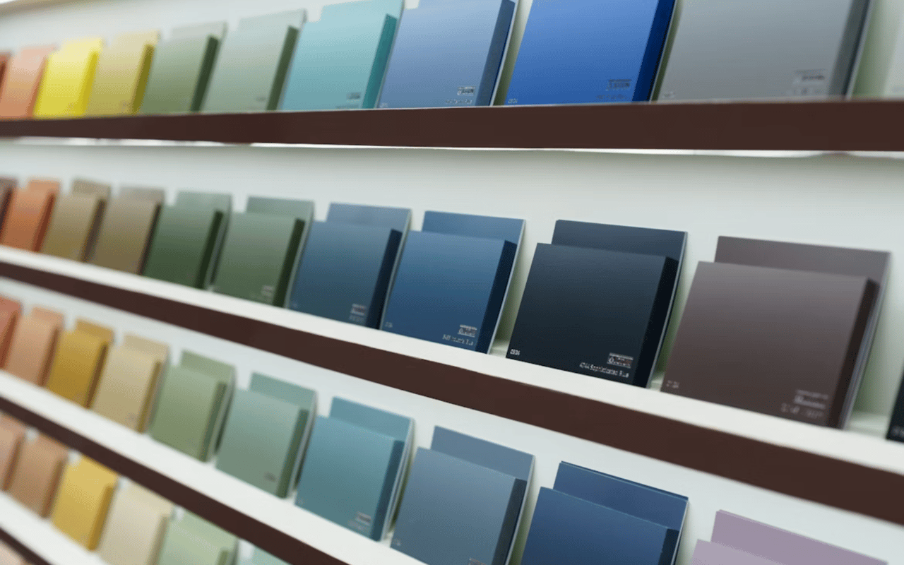
Testing Before Committing
Sample cans are worth the investment. Paint a section of the wall or use large poster boards to test multiple shades in different parts of the room. View the samples in morning light, midday brightness, and evening lighting to see how they shift.
This step can save time and money by avoiding a color that looked perfect on the sample card but feels off once it’s on the wall. It also helps you compare similar shades side by side.
Creating Flow Between Rooms
For homes with open layouts or sightlines from one room to another, it’s important to consider how colors transition between spaces. Using shades from the same color family can create harmony while still offering variety.
If you want more contrast, try using a consistent neutral tone throughout the main areas and layering bolder colors in individual rooms. This allows each space to have its own personality without feeling disconnected from the rest of the home.
Working with Neutrals
Neutrals remain a reliable choice because they offer flexibility. White, cream, beige, and gray provide a backdrop for furniture, art, and accessories to stand out. They also make it easier to refresh a room over time since you can change decor without repainting.
The key is choosing the right neutral for the space's lighting and style. A bright white may work well in a modern kitchen but could feel stark in a cozy bedroom. Soft, warm neutrals tend to feel inviting, while cooler neutrals create a sleek, contemporary look.
Bringing It All Together
Choosing the right paint tones means balancing personal style with the practical aspects of lighting, room function, and existing finishes. By understanding how color behaves and taking the time to test options, you can make decisions that will stand the test of time. Whether you prefer bold contrasts or subtle shifts, the right palette can enhance the character and comfort of every space in your home.
Finding a Home That Fits Your Vision
Designing a space you love starts with the right foundation. Your home in Purcellville, VA, will be the place where your design ideas can come to life, so it’s important to determine your must-haves. That might mean a home with the perfect natural light for your chosen color palette or a layout that works with your decorating style.
Diana Geremia understands how to connect buyers with properties that align with their vision. With deep knowledge of the Purcellville real estate market and a clear understanding of how design plays into long-term satisfaction, she can help you choose a home that feels right from the start. When you’re ready to find a property where your style can shine, work with Diana Geremia to navigate the market.
*Header image courtesy of Unsplash